March 2008

Feature in Foam Magazine and my illustrated MJM Organic Cosmetic labels.

MJM cosmetics
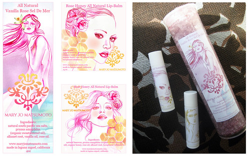
I made these labels for Mary Jo Matsumoto‘s new line of delectable all natural goods. The labels above are Vanilla Rose Sel De Mer and Rose Honey Lip Balm. Did I mention that they’re all natural? I love the balms, they’re so silky and soft. They make you smooooth. Here the labels are on their packages. Thanks for sending them over Mary Jo!

Foam Magazine did a piece on my work and daily illustration challenge. It’s a great magazine, makes me want to go to the beach and surf…also so lose about 30 pounds so I can wear a crochet bikini! (you can pick up the March issue at any store like Barnes and Noble and Borders or read it digitally, I’m on page 94).
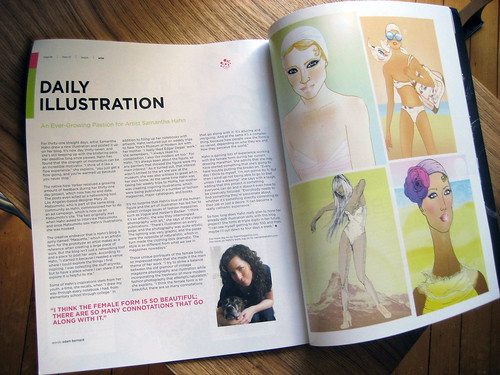
 FOAM Magazine

Wren bags and blog: A South African surface/textile designer’s foray into fashion. She does it all.

wren bags

I love these Wren bags on Etsy. The Wren blog is also fascinating to me as I’ve been getting very interested in textile and surface design lately. Each bag is one-of-a-kind, made by Wendren or occasionally a couple of artisan seamstresses she knows from her community in South Africa. The fabrics are so beautiful and the structure really graphic and efficient. Wendren was even nice enough to comment on my patterns with some great advice. Perhaps, if I keep following her blog I’ll learn a thing or two about textiles from her. She’s a pro.

Check out the shop before all the bags go. They’re selling like hotcakes. My favorite design is being admired by some quick buyer’s friends as we speak!

* Speaking of gorgeous textiles, we just got our Amenity Pillows…but Pita has claimed them for herself.

Here’s where you can get Amenity stuff.

Spontaneous picnic dress. I’ve been waiting for this my whole life.

picnic dress
I adore picnicking. This dress on Reddish Design Studio is my dream come true. All I’ll need is a picnic basket hat!!

The spontaneous picnic dress was made from 3 different food related fabrics: Plastic bid, kitchen towel, table cloth. The Buttercup dress lets you have a festive meal wherever you are. A proposition for a weird Japanese competition in 2002. I can’t believe it won nothing.

I’m going to a picnic and I’m bringing Apricots, Berries, and….Chocolate pencils, yum.

Reddish is a great Design site with wonderful things to wear and use, such as this amazing necklace.

*Pan-Dan was my super source for this good stuff! It’s a fabulous blog so check it out.

p.s if you live in Brooklyn check out Gorilla Coffee. My husband and I have been strolling there after dinner each night for a decaf latte. It’s yummy. Not fancy, just yummy. For a little more artisanal coffee and experience try Grumpy’s. My husband’s been a coffee connoisseur since living in Seattle near Vivace and it rubbed off on me.

The Pink & Blue Project: Photographs by JeongMee Yoon, sparking debate on gender and color.

header pink and blue project

A fabulous Project on Color and Gender:
Last spring my dear friend Erin of Culinography received her M.F.A in photography at The School of Visual Arts in New York. The program culminated in a thesis exhibit. I loved Erin’s work and the work of her classmate Jeongmee Yoon. This was all before my Colour Lovers contributing days. Thankfully my new favorite blogger Joanna Goddard of A Cup Of Jo blog reminded me of Yoon’s work. The New York Times just ran a piece on it too since it’s in a show right now (info below).

blue 1

JeongMee Yoon:
Yoon provokes a conversation on gender and how consumerism helps to define it. Yoon confronts us with the easy polarization of color as prescribed to each gender (pink for girls and blue for boys). Her work evokes a dialogue that circumvents cultural boundaries. Consumerism’s arm is long. Yoon poses us with the supposition that perhaps it is us who bring significance to color rather than color imposing it on us. In fact, many color associations are disparate, constructions that vary with culture and time. To read more on that fascinating topic read this Wikipedia entry. While you are at it, check out this article on gender and education, delving deeper into the issues of why different genders might chose to draw with certain crayon colors and learn better in certain color classrooms. I don’t want to digress away from Yoon though….so back to it…

pink1

Where You Can See Yoon’s Project:
Jeongmee Yoon’s work can be viewed at Jenkins Johnson Gallery in New York from March 6th- April 26th.

Some patterns I made over the weekend. Plus SJP “Girls Just Want to Have Fun” Dance-Off!!

my patterns

my patterns2

I felt like doing some abstract work on Sunday morning. I’m usually very representational but I just got my drawing board set up and did not feel like being bogged down with reference so I took out my colored inks and started playing around with color and shape. The patterns above are what I came up with after layering my paintings digitally. I have so much fun working this way. It feels like a break from what I usually do. Freedom! I wish I could make the patterns into dresses, coats, and pillows…someday perhaps.

* Tangentially but awesomely, Here’s the best dance off ever with Sarah Jessica Parker.

News:

We just finished the mantle off in the bedroom with an antique mirror I found at a cute shop around the block.

My husband and I decided what we’re going to eat on our 1 year wedding anniversary in June. Here’s a picture of it from Mad Baker.

My mother in law just sent me this beautiful view of the world.

Search

Books